The Regnstone brand.
A slab of stone, cut once. This page is the whole identity: the mark, the words, the colours, the type and how it moves. It is short on purpose.
01The idea
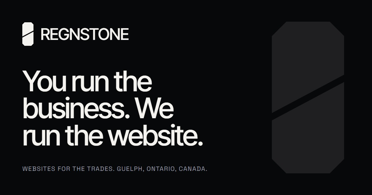
Regnstone is a stone cut once, precisely. The mark is a slab with a single diagonal cut through it. The same slab, whole and in brushed metal, is the object that floats through the homepage: its face is a screen, because what we build is what people see on a screen.
Everything else on the page stays quiet so the slab and the words can be loud. Black background, white type, one object. No colour except what the client sites bring with them.
02The mark
Two shards, one cut, always in these proportions. Use the white mark on black and the black mark on white. Never add a gradient, a shadow, an outline or a third colour. Keep clear space around it equal to half the mark’s width. Do not use the mark smaller than 16 pixels tall; for browser tabs and app icons use the rounded square version below.

03The wordmark
REGNSTONE is set in Inter Tight Medium, all capitals, with the letters pulled tight (tracking of minus 3 percent). The full company name, Regnstone Digital, appears only in small text: footers, legal pages and documents. In a lockup, the mark sits to the left of the wordmark with a gap a little over half the cap height; the mark is about one and a half times the cap height.
04Colour
The brand has no accent colour. Black is the page, white is the voice, grey is the supporting text and hairlines (white at 14 percent and 32 percent). Silver exists only as the rendered metal of the slab. If something needs to stand out, make it bigger or whiter, not coloured.
05Type
Two families only. Inter Tight does the talking at every size, from the giant footer wordmark down to body copy. Space Grotesk, in small capitals, does the signposting: section labels, buttons, the header tagline, and the price table captions. Headlines are Medium weight with tight tracking; nothing is ever Bold.
06Motion
One object, driven by scrolling. The slab assembles once when the page loads, then turns, tilts and opens as the visitor moves down the page. Nothing else animates on its own. Buttons lean toward the cursor; the cursor is a small white dot. Visitors who have asked their device for reduced motion get the same page with the slab standing still.
The loading moment is the wordmark in the bottom left and a count to 100 in the bottom right, then the black curtain lifts. It shows once per visit.
07Voice
Plain, confident, short. We talk to people who are masters of their trade and do not want to become experts in ours. Say what the thing does for them. Keep every sentence standing on its own. No jargon, and when a technical word cannot be avoided, explain it in a few words.
Say
- You run the business. We run the website.
- We make it look as good as your work.
- Security, updates and uptime are on us.
- We reply within one business day.
Do not say
- Leverage our end-to-end digital solutions.
- Best-in-class, cutting-edge, seamless.
- Our stack, our framework, our CMS.
- Anything that needs a glossary.
08Files


Fonts: Inter Tight and Space Grotesk, both free from Google Fonts.